Sunday, 28 February 2016

A stationery haul from Cloudy Cow!


So last week I got a little-ish haul from Cloudy Cow; a shop run by the wonderful Daisy of MyGreenCow, who was one of the bloggers who really inspired me to start my youtube channel and subsequent blog/instagram account etc.

Some of the stuff I wanted was out of stock but I still ended up with quite a few lovely bits.


So here's what I got:

First up these brightly coloured alphabet stickers

  
The stickers are printed on clear plastic so will blend in on any background and have all sorts of bright colours and patterns. You get 78 pieces (3 of each letter) for £1.90


I got this little tassle planner charm in bright bright pink. It comes in this sweet little organza bag.


They come in lots of different colours and with gold or silver chains. I've put it on my Nordic Nights Paperchase organiser (review coming soon) 


Now some sweet little Totoro magnetic page markers. There are 4 different varieties but I had to pick the one with the pink Totoro! 


Next some cute owl stickers. There are 10 different designs with 5 on white and 5 or Kraft coloured backgrounds. They're mainly owls but with some other bits too.


Next more stickers! This time a sheet of them with tonnes of different, insanely cute designs. 


It's hard to tell in the photos but the stickers feel almost like washi tape.


And speaking of Washi tape, I got 3 kinds! The Spider web design was on sale for £1.50 and the others were £1.80 each. My favourite design is probably the multi coloured hearts, it's simple but just so pretty


So that was my first Cloudy Cow order but I'm sure it won't be my last! Shipping in the UK depends on the amount you purchase, I think mine was an odd amount like £2.06 or similar. One thing to note is that currrently orders only ship once a week on Fridays. I made my order on a Thursday and it arrived on Saturday morning so it was processed really fast. Everything was great quality and a fair price. So check out Cloudy Cow here and be sure to check out Daisy's blog and youtube .


Saturday, 27 February 2016

Saturday Smashbook Show and Tell 3

Hi everyone!
These are probably some of my favourite Smashbook pages so far. I can't really say why, I just really like them. Although I still feel they could all be busier. I think my problem may be overthinking the pages. Instead of just 'Smashing' stuff in I'm very hungup on composition and theming the pages and so on. I need to get a bit looser and more free.

Anyway if you'd like to watch this being made you can see my video here 

This first page is meant to be a pink, girl, gaudy, tacky mess.
I started with a page in my Smashbook which was pale pink with diamonds all over. I then layered a piece of holographic/iridescent pink wrapping paper and a fabulous postcard of Barbara Cartland.


Look at her in all her soft-focused glory.


I then finished off the page with some slightly metallic gold gum paper stars and pink fabric bows.

 
I feel like I need to get some pink Marabou to frame the whole page!


My final page for today was this pest/insect page. The original Smashbook page was a sort of textured red-orange back with little fly doodles. The main image was the cover of a booklet from the 2009 South Bank Centre Pestival season. Every summer the South Bank Centre in London has a sort of themed festival type thing with food, concerts, art and so on and Pestival was themed around insects.


At the bottom I put part of a flyer for a music night I went to which is an antique-ish looking image of Beetles in bell jars. It's slightly damaged but I didn't mind that.


Then I also added  this little image which was also in the Pestival leaflet. It's a photo of a piece of sculpture. I wanted to make the page look like a posterboard or bedroom wall where someone had just stuck up images. To try and achieve this I added some small, messily ripped bits of washi tape. Finally i added some little 3D insect stickers from Paperchase all over 


I'd love to hear your thoughts on these pages or my Smashbooking style in general. If anyone has any tips on being more free with my pages that would be amazing.
But anyway thank you so much for reading this and I hope you all have a great saturday.#
xxx

Saturday, 20 February 2016

Saturday Smashbook Show and Tell 2

These pages are all featured in my first Smashbooking video which you can see here. I hope you enjoy a closer look at them!

My current basic Smashbooking approach is to find one main 'thing' (be it a photo, flyer, postcard etc) that I'm drawn to and to then build the page around it.

So for instance with this page I chose a page from an art exhibition leaflet I had gone to and then tried to find other elements that I felt complimented it.


I found the main picture was quite calming to look at so I wanted to try and keep that soft, dreamy feeling. I chose this softly textured, buttermilk coloured page of my Smashbook with little 'Brain lint doodles' and then added some light grey and yellow washi tapes to just break up the page a bit.


To match the washi Tape I added this lovely feather I had


and then I finished the page with this little card. I got this from one of those mechanical fortune telling machines you get in arcades and fairs and things. I'd previously kept it in with some art supplies and it's been a bit marked but I think that works with the rest of the page.


Usually I like my pages to be a bit more busy than this, but I think this page is finished. I like it being a bit sparse, I feel like it works with the softness of the colours and images.

The next page wasn't very well documented in my video as my camera was playing up when I was making it. 


I've never been to the 'Fleet Air Arm Experience', I just found a flyer for it on holiday a few years ago and had to keep it because I find it hilarious. Why is there a giant boys head floating on top of the helicopter? And just look at his face:


Just look at him!


Anyway I chose a sort of school workbook style lined page from my Smashbook for it, then covered it with interwoven strips of thin, bright coloured washi tape. I bordered the image with more washi tape and added a neon sticky note arrow and some brightly coloured stickers. I might add more to this page if I find something bright that works in the composition but for now I like it as it is. 

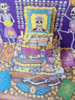
This last page is themed around a Dia De Los Muertos altar card my Dad brought me from Mexico.


I couldn't find a page in my Smashbook that i felt went with the card so I used a piece of decorative paper I had from a pad from Tiger. Then I used some red lace style tape to border it. 


Finally I added some little wooden decorative hearts. 


Here's the card opened up: 


My favourite of these pages is probably the first, yellow one. I just feel like I've composed it quite well. What do you think?

Have a great Saturday everyone!
xxx


Saturday, 13 February 2016

Saturday Smashbook Show and Tell 1

 Here are my first few Smashbook pages to share with you. These are all sort of finished.  I mean I'm happy with them as they are but I might still add to them in the future.

 This is one of the very first pages of my Smashbook so at the moment it's a sort of 'Welcome' page.


 I really love the colour combinations of the light blue, bright pink/fuchsia and the red of the heart and Moomin picture. I think it's looking a bit bare at the moment but I can't find anything that goes with it currently.


I've used a pink glitter washi tape from Tiger to create diagonal stripes on the background, the 'Hello' is from a 'quick start' manual that came with our sky box. Then at the top I've stuck in my old student oyster card.


The Moomin picture is a print out that my Dad glued a card backing onto to use as my Birthday card. I absolutely love the Moomins and especially these Stop-motion puppet versions. The heart is a sticker from Tiger.

Next is one of my Sparks pages. 


Sparks are my favourite band in the whole world ever and over the years I've collected a lot of paraphernalia about them. I'ts really nice to look at it all in one place


This is my 'Golden Ticket' from back in 2008 when they played all 21 of their albums over 21 nights. And this ticket let me go to every single one. It was fantastic. I've attached it to the page with a piece of old ribbon.


The backing is an advert for those 21 nights (a bit worse for wear after 8 years) I have also added some washi tape to add colour and interest to the page. The orange spotty tape is from Hema and the thin pink is from Tiger.


Finally at the bottom I've taped in a little booklet of tickets from other Sparks gigs. I've been to many gigs but can only seem to have kept 3 tickets, I'll add to the booklet if I can find any more.

I hope you enjoyed seeing these pages. I'm still new to Smashbooking so if anyone has any tips or suggestions I would really love to hear.

Please check my youtube channel to see my Smashbooking process :)

Have a great Saturday!
xxx


Friday, 12 February 2016

Let's Smashbook!


A rather bad first attempt to document my Smashbooking! Hopefully the next time I film a video my camera won't keep cutting out.